
Dehumanization in DEI Visual Art
A counterrevolution in the arts is needed to restore beauty


“Art…is the barometer of a culture. It reflects the sum of a society’s deepest philosophical values: not its professed notions and slogans, but its actual view of man and of existence.”
-Ayn Rand-
Over the past couple of years, I have observed a certain style of visual art common among groups affiliated with women’s causes and diversity, equity, and inclusion (DEI) initiatives. The United Nations (UN), state governments, public universities, and non-profits have all created or shared this style of art—either on their websites, social media accounts, or in reports.
The art consists of illustrations characterized by human facelessness, disproportionate body segments, and/or a general simplification of human physical features—all amounting to a lack of realism of the art’s subject matter (i.e., humans). In other words, the art is dehumanizing.
Moreover, because art is a “selective recreation of reality according to an artist’s metaphysical value-judgments,” a piece of art tells us about the artist’s worldview and the worldviews of the individuals and groups who consume and reproduce it. Then, when many pieces of the same style of art become popular, they reveal the values and beliefs of the society. As Ayn Rand also explained: “The art of any given period or culture is the clearest and most immediate expression of its dominant philosophy.”
Thus, features of DEI visual art are not insignificant. They reflect the philosophy of the people who create the art, consume it, and share it.
One common feature of DEI visual art is facelessness. Specifically, human faces are drawn with few or no features, including the eyes, nose, lips, and ears. This artistic style projects human anonymity and shifts the focus from individual uniqueness to group identity, often the group’s race or gender. This focus on group identity is consistent with critical theory—the philosophy that underlies DEI. Also, facelessness minimizes personal responsibility and personal accountability—two things that should be heightened in contemporary society, not minimized.
Two other common features of DEI visual art are body shapelessness and disproportionate body segments. Often, in DEI art, body segments are shown as block-like objects. This also reflects a lack of prioritization of the uniqueness of the individual. It also reflects artistic laziness and a lack of appreciation of human anatomy. The lack of any muscular definition suggests a body that is incapable of movement and unfit to meet the physical demands of life. Therefore, the body is presented as a passive object acted upon by its environment. This view of man is consistent with the problematic field of “fat studies,” the high levels of obesity in society, and big public health’s misguided obsession with the “social determinants of heath.” The lack of appreciation of human anatomy is also consistent with a society that is confused about gender identity and the biological basis of the sexes.
This type of DEI visual art lacks beauty because it misrepresents the reality of the human body, and it shifts the focus from individual to tribal identity. Importantly, those who choose to create and share this art are not limited in their options or resources. For example, they could instead use photographs of humans rather than dehumanizing illustrations. They could also hire a professional illustrator to create better images, and if funds are lacking, they can use artificial intelligence to create meaningful images. Thus, individuals who create and use DEI visual art are choosing to do so against a backdrop of many other options that are available to them.
A counterrevolution in the arts is needed—from literature, to movies, to the visual arts. Postmodern nihilism has run its course, and it is time to restore beauty and romanticism. Part of this counterrevolution involves identifying unromantic art, revealing who creates and spreads it, and discussing the philosophical premises that underlie it.
Below, I present several examples of DEI visual art and briefly explain why they are problematic.
University of Illinois – Chicago
The illustrations below were published on the website of the Center for the Advancement of Teaching Excellence at the University of Illinois at Chicago. The first set of six illustrations appeared on the Center’s homepage. The second set of eight illustrations appeared on the Center’s page dedicated to “inclusive & equity minded teaching practices.” The third illustration appeared on the Center’s page dedicated to “equitable assessments & grading practices.”
All the illustrations have similar dehumanizing characteristics, namely facelessness and disproportionate body segments. For example, in the third illustration, which depicts a person holding the scales of justice, the face has no features, and the head is tiny compared to the rest of the body. In fact, the head is smaller than the person’s hand. Also, the hands are block-like objects with little definition of the fingers, making the person’s grasp on the object ill-defined. Finally, note that the two grades on the scale of “equitable grading practices” are A’s. Meanwhile, grade inflation is already a problem at universities.


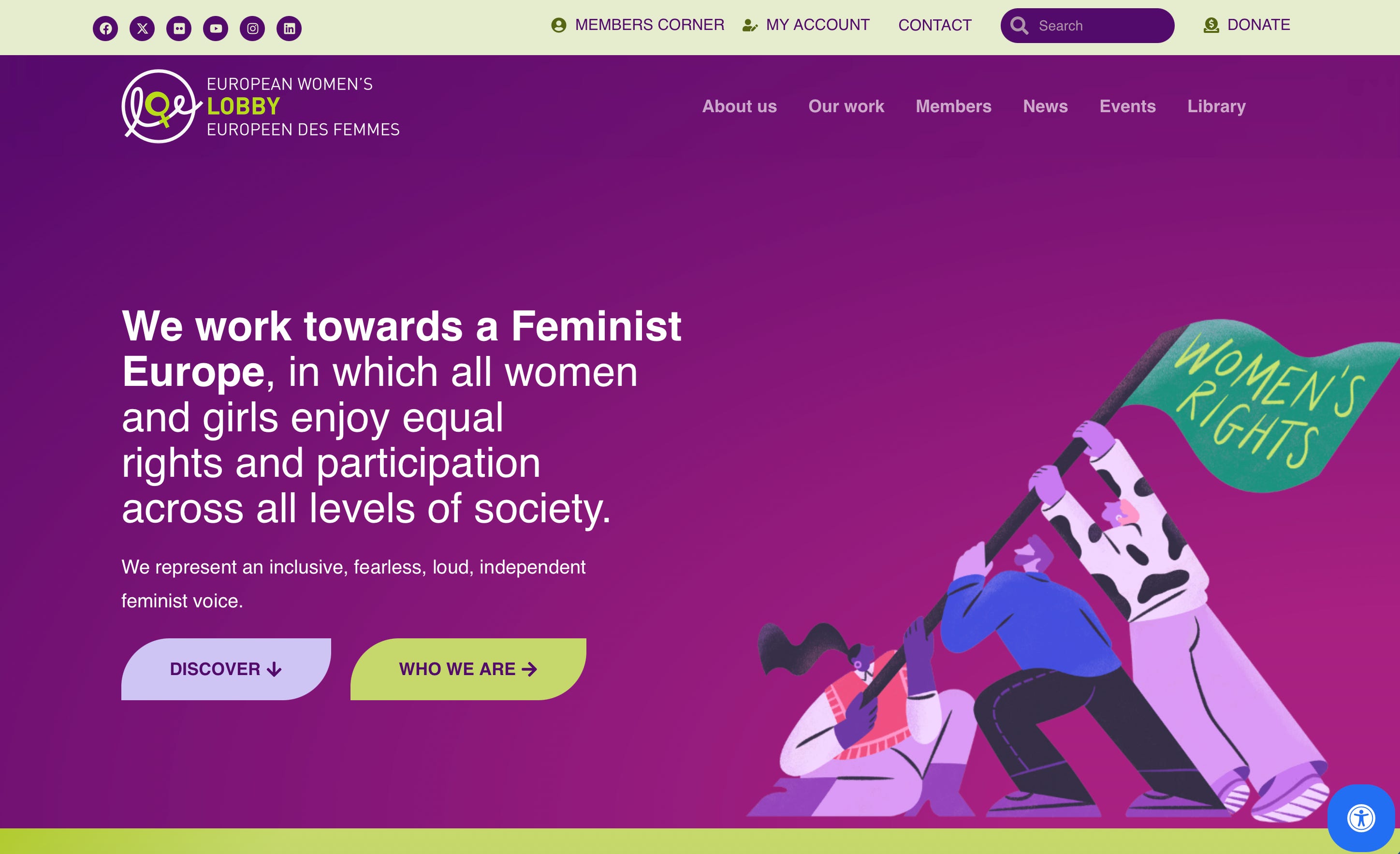
European Women’s Lobby
The illustration below was published on the website of the European Women’s Lobby. The individuals in the illustration have miniature heads. Note also the ambiguity regarding what is happening in the illustration. Are the people trying to erect the flagpole, prevent it from falling, or wave it in the air? If they are trying to erect or wave the flagpole, then the positioning of the person on the far right makes little sense. Such lack of mechanical precision is common in DEI visual art.
New South Wales Government
The illustration below is the cover of a workforce profile report published by the New South Wales government. The faces of the individuals have more defined features than in the above examples of DEI art. Nevertheless, the individuals lack certain details that would bring their faces more to life. Consequently, the viewer’s attention turns to the colors or skin tones of the faces. This then leads to an emphasis on racial or ethnic identity. In fact, the artist’s overemphasis on skin tone was taken to such an extreme, that the illustration includes an individual who has an unrealistic skin tone (i.e., pure white beyond albinism). Thus, the illustration communicates a prioritization of diversity in group identity.
Finally, all the individuals in the illustration are looking to the side. This communicates dismissiveness, and the meaning of the direction that they are looking is unclear. Likely, the direction that the individuals are looking holds no significance. Thus, it represents artistic inefficiency—a missed opportunity to communicate something meaningful.

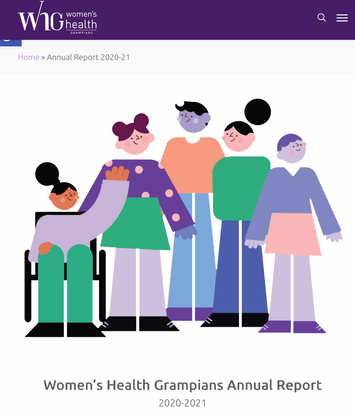
Women’s Health Grampians
The illustration below was published in a report by Women’s Health Grampians—a non-profit women’s health organization in Australia. The individuals in the illustration have some basic facial features and some of their bodies have proportional segments. However, none of the individuals have necks, and at least one of them does not have arms. Moreover, the body segments of all the individuals are blocks. Also, two of the faces have a purple skin tone that is inconsistent with human skin tones and suggests sickliness, death, and dehumanization.
The ages of the individuals in the illustration are somewhat ambiguous, but at least two of them appear to be adolescent girls. It is not accidental that a society that creates, consumes, and shares illustrations of kids with odd, block-shaped bodies, which are also missing body segments, is the same culture that administers hormones to kids to try to change (“affirm”) their gender identities.
University of Chicago
The illustrations below were published on the “inclusive illustrations” website of the University of Chicago’s Office of the Provost of Diversity and Inclusion. Block-like body segments are present in the illustrations – for example, some of the individuals have triangle blocks as feet. Also, though the webpage proclaims to be dedicated to “diversity and inclusion,” only one or two of the people in the illustrations appear to be male.

New York Times
In February of 2026, the New York Times published an article titled, “Seeking a Man Who Doesn’t Throw Tantrums.” The subtitle of the article was, “I had set my bar for relationships so low that any man who didn’t yell easily cleared it.” Consistent with these titles, the illustration depicts women’s superiority over undesirable men who seek her attention and cannot get over the low bar that she has set for them.
The individuals in the illustration have rudimentary eyes, noses, and mouths. They have no necks, their bodies are oddly shaped, and the way that their arms and shoulders intersect with their torsos is careless and unscientific. All the men have the same shirt size, and their pants are not properly filled with color.

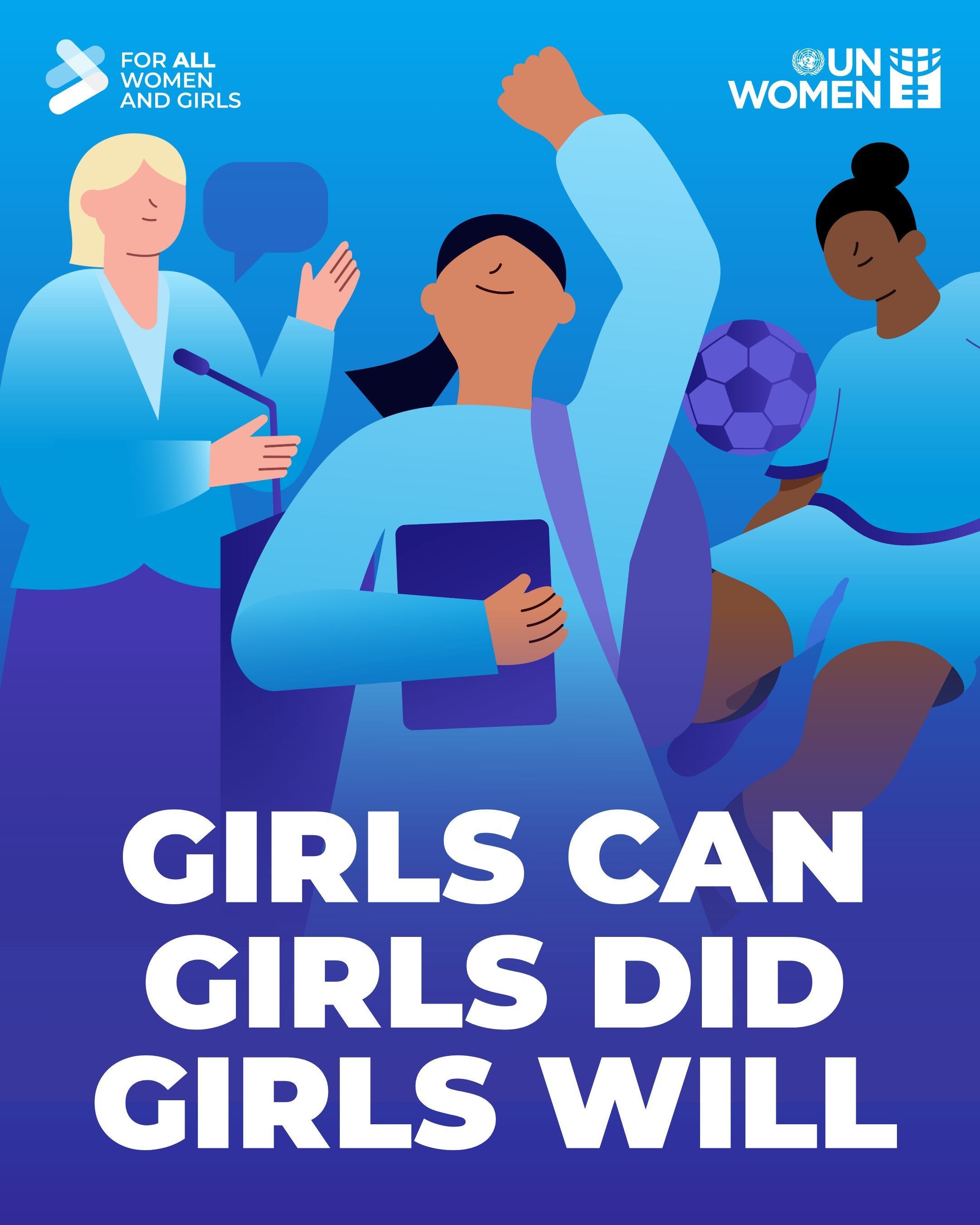
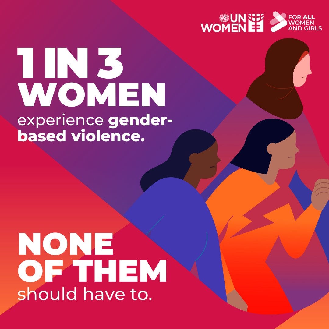
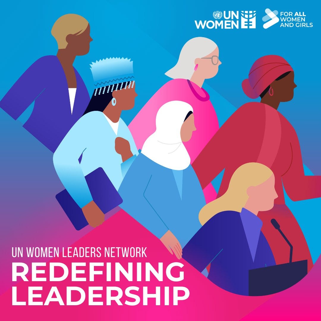
UN Women
The UN, specifically UN Women, has used dehumanizing DEI visual art many times. Several examples are provided below.
Few facial features are depicted in the illustrations. In the blue illustration of the “girls can” campaign, note how if the buns or ponytails are removed, one would not be able to discern whether the individuals in the illustration are female or male. An overreliance on one visual characteristic to define the sex of the illustrated person reflects the lack of individualization that is common in DEI art. Note also the lack of consistency with how the hands are drawn. Sometimes, the hands have defined fingers, whereas other times the hands are displayed as blocks.
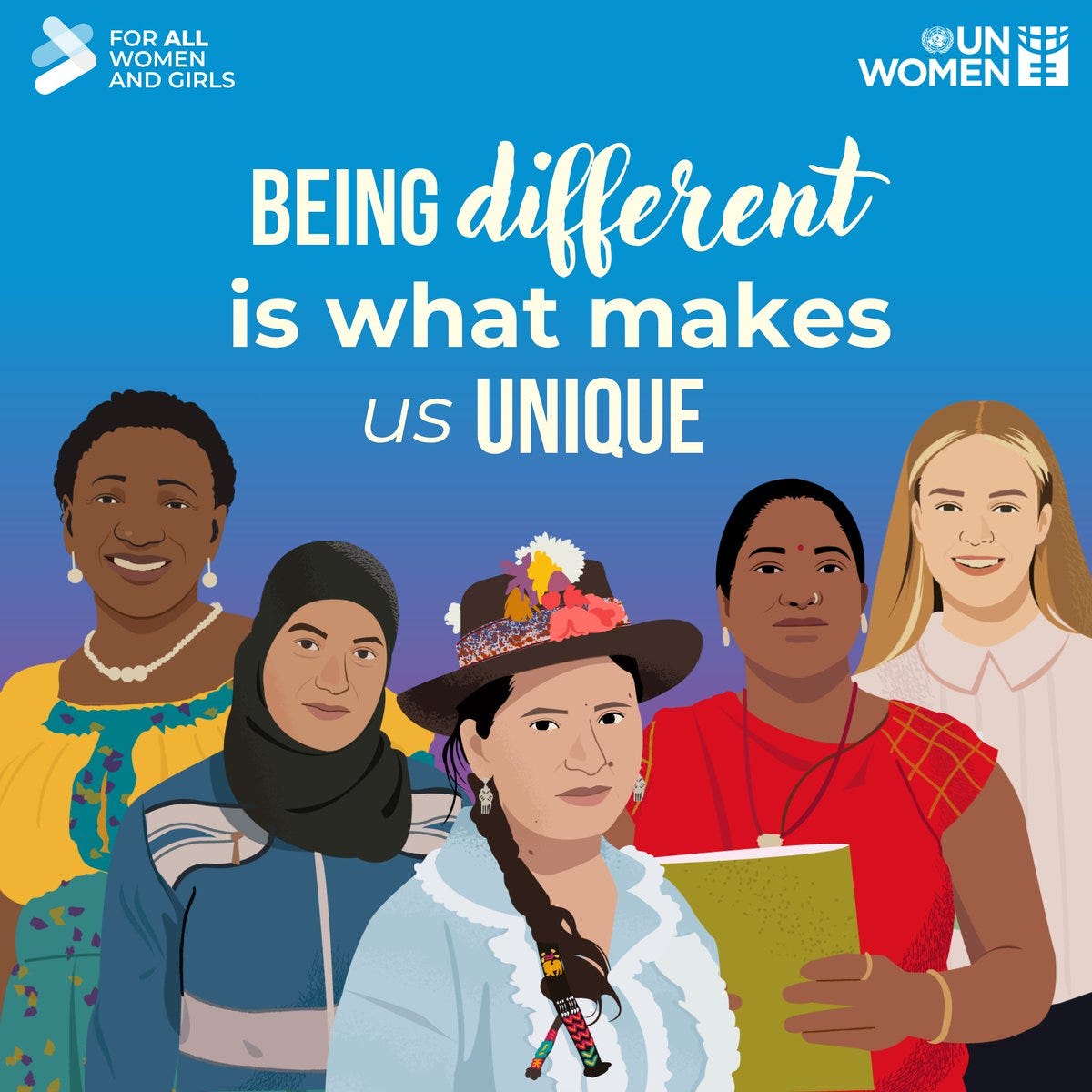
Finally, to give credit where credit is due, I share one rare example of a UN Women illustration that focuses on individualization. The message explicitly communicated by UN Women in that illustration is “being unique is what makes us different.” It is unclear why UN Women does not use this type of illustration or messaging more often.

Related Content at The Nuzzo Letter


SUPPORT THE NUZZO LETTER
If you appreciated this content, please consider supporting The Nuzzo Letter with a one-time or recurring donation. Your support is greatly appreciated. It helps me to continue to work on independent research projects and fight for my evidence-based discourse. To donate, click the DonorBox logo. In two simple steps, you can donate using ApplePay, PayPal, or another service. Thank you!

Excellent analysis. Thank you James.
The style is called Corporate Memphis. I think it was originally used by tech companies but (self-identifying) progressive groups seem to have taken a liking to it. I hate it!!!